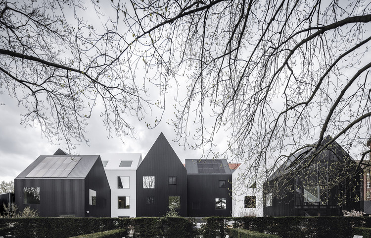
Le Corbusier stated in his seminal text, Towards a New Architecture, that “...man looks at the creation of architecture with his eyes, which are 5 feet 6 inches from the ground.” Logical and rational codes such as this form the standard for much of architectural production - but of course, these "norms" are as constructed as architecture itself. This particular standard is especially irrelevant when designing for children, for whom the adult-centric assumptions of architecture do not and should not apply.
As of 2018, children (i.e., people aged 15 years or younger) make up 26% of our global population; a statistic we should all appreciate given that a whopping 100% have, in fact, been children at some point ourselves. While there are a multitude of factors that shape the kind of adults we become, the architecture we encounter as children - be it the stacks in the library where you played hide-and-seek or the door handle you had to stand on tiptoes to reach - can have a great impact on your perspective of the world. When designing architecture for specifically for children, we are in a way molding these future perspectives, and it is therefore vital we treat the process with both rigor and empathy.
“Memories like these contain the deepest architectural experience that I know. They are the reservoirs of the architectural atmospheres and images that I explore in my work as an architect”
- Peter Zumthor, speaking of his childhood memories in Switzerland
It is perhaps practical to first consider this from a literal standpoint: a young child’s eyes are, on average, about 3 feet 6 inches from the ground. Bad design for children is relatively simple to pick out as it typically ignores this fact (and often continues to fail from there.)
As many architectural governing bodies (such as the AIA and RIBA) push for more localized standards for school design, particularly those aiming to promote safety and healthy learning environments, architects must still consider things such as. What spaces will encourage learning? What plans will promote play? How can we create the right level of social interaction between ages?
Generally speaking, there are no universal laws for good design. But thanks to decades of research regarding the sociological and psychological development of children at universities across the world, there is data to at least suggest a number of key principles: the encouragement of social interaction, the promotion of playful learning, and the involvement of nature. How these things principles are realized can vary immensely.
In his speech to congress, the new Sandy Hook School architect Jay Brotman referenced how design for children, in particular schools, depends heavily on the individual community and the context. This, with the added individuality of the architect, creates a bespoke and organic design process from the off. Certain schemes promote certain characteristics, and some projects lean heavily on certain techniques, all doing so to achieve a successful child-friendly space that suits the function best. Through delving into what makes a successful, child-centric design, we can begin to make note of the binding attributes that great schemes share.
“We have an innate capacity for remembering and imagining places.”
- Juhani Pallasmaa, the Eyes of the Skin
Safety
While often not the most appealing of design influences, safety is by far the most important characteristic of any scheme for children. This need not, however, refer to the "bubble" approach to safety; an approach which lazily often results in soft edges with soft materials in soft designs. A more basic understanding of safety for children is the notion that, as an adult, you are able to see the child anywhere in the space.
Schools and kindergartens are key proponents of using plan to protect their children. VERSTAS Architects demonstrate this in their Saunalahti School scheme, where a dominating, linear brick facade creates a border to the public, and the enclosed area uses the typology of the site to ‘herd in’ the students, without the feeling of complete enclosure.
Play
Article 31 of the UN Convention on the Rights of a Child states that “every child has the right to relax, play and take part in a wide range of cultural and artistic activities.” Architects have a responsibility to design spaces that enable the essential natural creativity and freedom of play, and nurture it. This can be achieved in several ways, but can be boiled down to structured play and abstracted play.
U.K. based Turner Prize winning design collective Assemble created an exhibition that summarized the themes of abstract play in 2015. ‘Brutalist Playground’ used the play areas of the 1950s and 1960s social estate architecture, promoting the ability of their solid and non-descript forms to create a space that encourages children to fill in the blanks with their imaginations. According to the research, these spaces gave the children the autonomy to do as they pleased, learning and growing along the way. ASPECT Studio applied many of the same principles into its colorful Wantou & Vanke Paradise Art Wonderland park in Heifei, China.
Contrasting this open-ended approach, the work of French architects NP2F demonstrates equal success from a more structured approach. Utilizing the traditional methods associated with urban sport spaces and play areas, NP2F guided the development of their Evolution Ground Alfortville project in such a way as to “promote a decompartmentalization of sport spaces,” maintaining a known method of interaction for the children. The project, with its areas of “urban gentleness” creating an adaptable, highlights this approach in a multi-use space. “The importance given to detail (ground, morphology, folds and boundaries) allows us to offer to the young people of the ZAC, beyond a simple football ground, a “configured” space, space of encounters and exchanges,” the architects explain in the description of the project.
Liberation
In a world designed for adults, sometimes one of the most important features of child-centric architecture is child-only features. Enabling children to interact or navigate with the architecture in a way that is unique to their circumstance can be essential to the idea of play, letting the children truly be independent and self supporting through the nature of the design.
Five Fields Play Structure by Matter Design + FR|SCH shows how multiple levels of space can be juxtaposed into a fun, condensed setting, that allows adults to access each part but at a hindered pace and freedom to the children. “Dedicated to imagination” and “resisting literal and singular readings”, the structure is designed with the nimble nature of its client in mind. Sitting on a green, sloping context, Five Fields uses a carefully imagined plan to create several areas where children can interact with the architecture on their own terms, “liberating the kids to fly through the spaces”.
Adaptability/Openness
The one thing universal about children it is that no child is the same. By extension, no one interaction with a child is the same, and the day-to-day ways in which a child uses space may differ significantly. This is partly the reason why your traditional square, isolated classroom has been proven inefficient in the teaching and developing of young people. Spaces must be malleable, and must be able to adapt to any given situation. They must also be open, and have access to nature, as children are not meant to be restricted to the confines of our adult preconceptions of space.
One of the greatest examples of this adaptability and openness is the award winning Fuji Kindergarten by Tezuka Architects. The distinctive oval shaped plan, which features a large green space in the center and a generous, wooden roof terrace all around promotes the natural movement of children through the space. The kindergarten, as a consequence of this plan, has one of the highest athletic abilities in the area, as children who go there move on average 4km per day. The classrooms themselves have no walls, as the continuous plan means the children can never get lost or wander far away, and this open architecture is summed up by Takaharu Tezuka when he says:
This kindergarten is completely open, most of the year. And there is no boundary between inside and outside.So it means basically this architecture is a roof. And also there is no boundary between classrooms. So there is no acoustic barrier at all. When you put many children in a quiet box, some of them get really nervous. But in this kindergarten, there is no reason they get nervous. Because there is no boundary.
This openness and involvement of nature is something that Danish office Dorte Mandrup consistently shows within their work, from the hillside-like Råå Day Care Center to the more urban Kanderborggade Day Care Centre.
Understanding
In many recent projects, research and design are fused together in order to create specialized spaces for certain groups of younger people. The research project Social Sensory Architectures use their work to create spaces that are both comforting and helpful to children with autism, while Spencer Luckey’s abstract, undulating platforms “form a blank canvas for the children to establish their own narrative” in a gender-neutral playground.
Catalytic Action create design play structures within refugee communities, letting the children take ownership of the design to provide relief and independence to a community of children that often has to grow up faster than others.
Providing spaces for counseling and support within schools is a key issue, as the mental pressure of being a child has arguably never been more of an issue. Architect Karina Ruiz emphasizes the importance of locating these spaces in key areas, in order to avoid disenfranchisement or the feeling of isolation. “Simple things like moving a counseling wing and putting those where students are located—near commons, near libraries—and then making them transparent.”